4.2 Comparing Plotting Libraries and Declarative Visualizations#
from plotnine import *
from matplotlib import pyplot as plt
from plotnine import data
import plotly.express as px
import seaborn as sns
mpg = data.mpg
Bar Chart#
mpg
| manufacturer | model | displ | year | cyl | trans | drv | cty | hwy | fl | class | |
|---|---|---|---|---|---|---|---|---|---|---|---|
| 0 | audi | a4 | 1.8 | 1999 | 4 | auto(l5) | f | 18 | 29 | p | compact |
| 1 | audi | a4 | 1.8 | 1999 | 4 | manual(m5) | f | 21 | 29 | p | compact |
| 2 | audi | a4 | 2.0 | 2008 | 4 | manual(m6) | f | 20 | 31 | p | compact |
| 3 | audi | a4 | 2.0 | 2008 | 4 | auto(av) | f | 21 | 30 | p | compact |
| 4 | audi | a4 | 2.8 | 1999 | 6 | auto(l5) | f | 16 | 26 | p | compact |
| ... | ... | ... | ... | ... | ... | ... | ... | ... | ... | ... | ... |
| 229 | volkswagen | passat | 2.0 | 2008 | 4 | auto(s6) | f | 19 | 28 | p | midsize |
| 230 | volkswagen | passat | 2.0 | 2008 | 4 | manual(m6) | f | 21 | 29 | p | midsize |
| 231 | volkswagen | passat | 2.8 | 1999 | 6 | auto(l5) | f | 16 | 26 | p | midsize |
| 232 | volkswagen | passat | 2.8 | 1999 | 6 | manual(m5) | f | 18 | 26 | p | midsize |
| 233 | volkswagen | passat | 3.6 | 2008 | 6 | auto(s6) | f | 17 | 26 | p | midsize |
234 rows × 11 columns
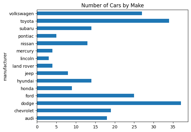
# Pandas
(mpg['manufacturer']
 .value_counts(sort=False)
 .plot.barh()
 .set_title('Number of Cars by Make')
)
Text(0.5, 1.0, 'Number of Cars by Make')
# Plotnine (ggplot2 clone)
(ggplot(mpg) +
   aes(x='manufacturer') +
   geom_bar() +
   coord_flip() +
   ggtitle('Number of Cars by Make')
)
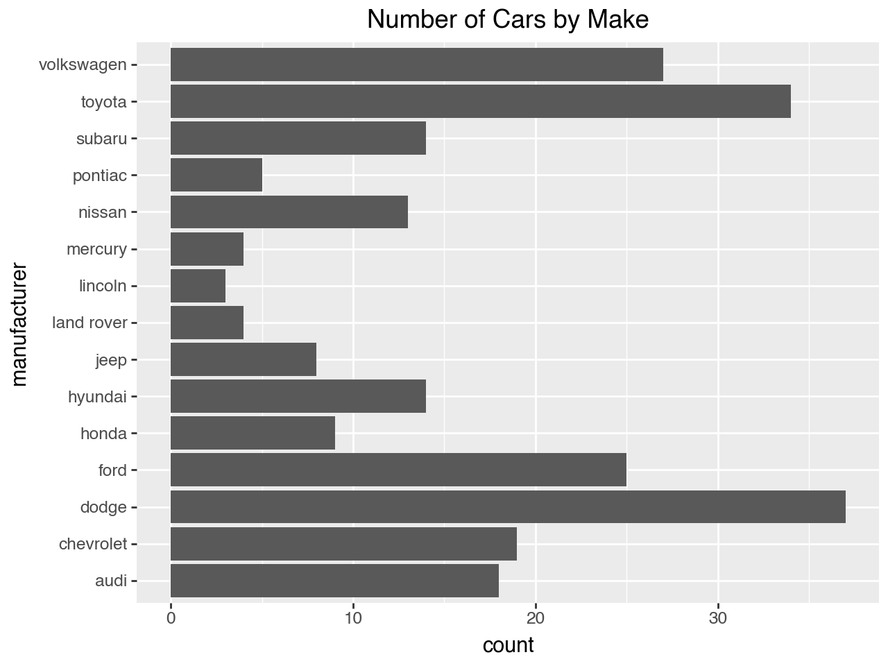
fig = px.bar(
    mpg.groupby('manufacturer', observed=False).size().reset_index(name='count'),
    x='count',
    y='manufacturer',
    orientation='h',
    title='Number of Cars by Make',
)

fig
Scatter Plot#
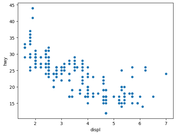
(mpg.
    plot.
    scatter(x='displ', y='hwy'))
<Axes: xlabel='displ', ylabel='hwy'>
mpg
| manufacturer | model | displ | year | cyl | trans | drv | cty | hwy | fl | class | |
|---|---|---|---|---|---|---|---|---|---|---|---|
| 0 | audi | a4 | 1.8 | 1999 | 4 | auto(l5) | f | 18 | 29 | p | compact |
| 1 | audi | a4 | 1.8 | 1999 | 4 | manual(m5) | f | 21 | 29 | p | compact |
| 2 | audi | a4 | 2.0 | 2008 | 4 | manual(m6) | f | 20 | 31 | p | compact |
| 3 | audi | a4 | 2.0 | 2008 | 4 | auto(av) | f | 21 | 30 | p | compact |
| 4 | audi | a4 | 2.8 | 1999 | 6 | auto(l5) | f | 16 | 26 | p | compact |
| ... | ... | ... | ... | ... | ... | ... | ... | ... | ... | ... | ... |
| 229 | volkswagen | passat | 2.0 | 2008 | 4 | auto(s6) | f | 19 | 28 | p | midsize |
| 230 | volkswagen | passat | 2.0 | 2008 | 4 | manual(m6) | f | 21 | 29 | p | midsize |
| 231 | volkswagen | passat | 2.8 | 1999 | 6 | auto(l5) | f | 16 | 26 | p | midsize |
| 232 | volkswagen | passat | 2.8 | 1999 | 6 | manual(m5) | f | 18 | 26 | p | midsize |
| 233 | volkswagen | passat | 3.6 | 2008 | 6 | auto(s6) | f | 17 | 26 | p | midsize |
234 rows × 11 columns
(mpg
 .plot
 .scatter(x='displ', y='hwy')
 .set(title='Engine Displacement in Liters vs Highway MPG',
      xlabel='Engine Displacement in Liters',
      ylabel='Highway MPG'));
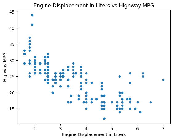
(ggplot(mpg) +
    aes(x = 'displ', y = 'hwy') +
    geom_point() +
    ggtitle('Engine Displacement in Liters vs Highway MPG') +
    xlab('Engine Displacement in Liters') +
    ylab('Highway MPG')
)
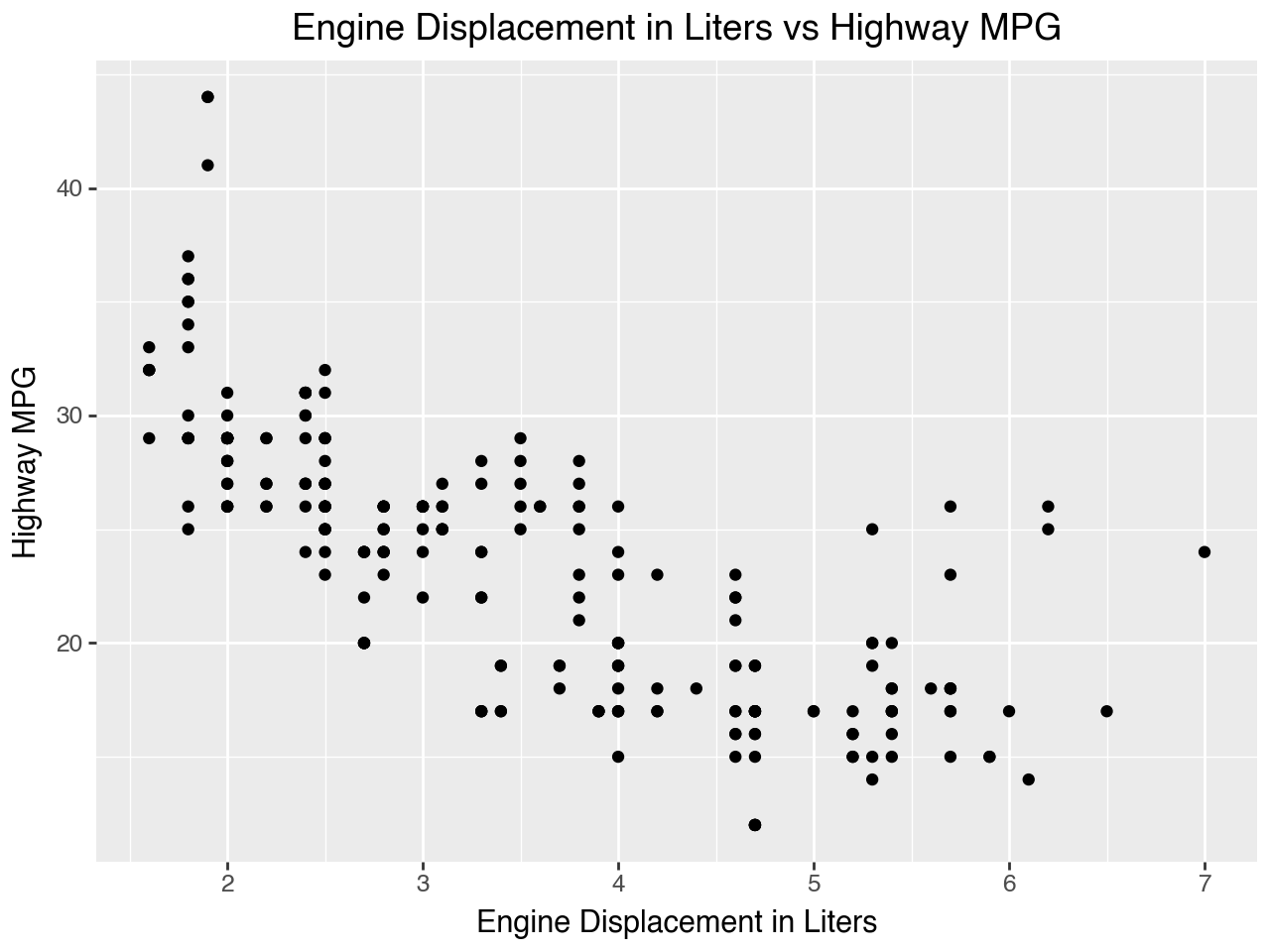
fig = px.scatter(
    mpg,
    x='displ',
    y='hwy',
    title='Engine Displacement in Liters vs Highway MPG',
    labels={
        'displ': 'Engine Displacement in Liters',
        'hwy': 'Highway MPG'
    }
)

fig.show()
Scatter Plot, Faceted with Color#
for c, df in mpg.groupby('class'):
    plt.scatter(df['displ'], df['hwy'], label=c)
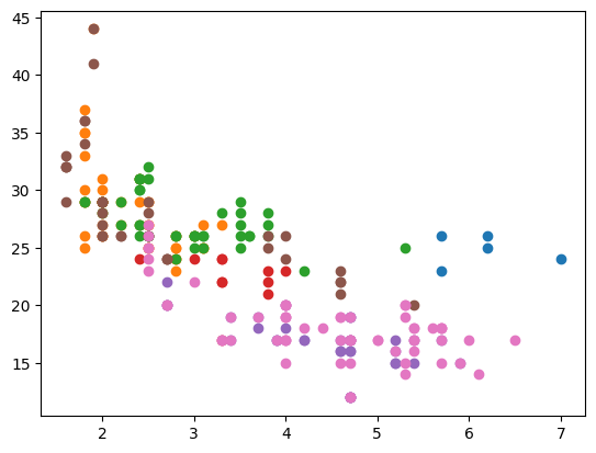
fig, ax = plt.subplots()
for c, df in mpg.groupby('class'):
    plt.scatter(df['displ'], df['hwy'], label=c)
fig, ax = plt.subplots()
for c, df in mpg.groupby('class'):
    ax.scatter(df['displ'], df['hwy'], label=c)
ax.legend()
ax.set_title('Engine Displacement in Liters vs Highway MPG')
ax.set_xlabel('Engine Displacement in Liters')
ax.set_ylabel('Highway MPG')
Text(0, 0.5, 'Highway MPG')
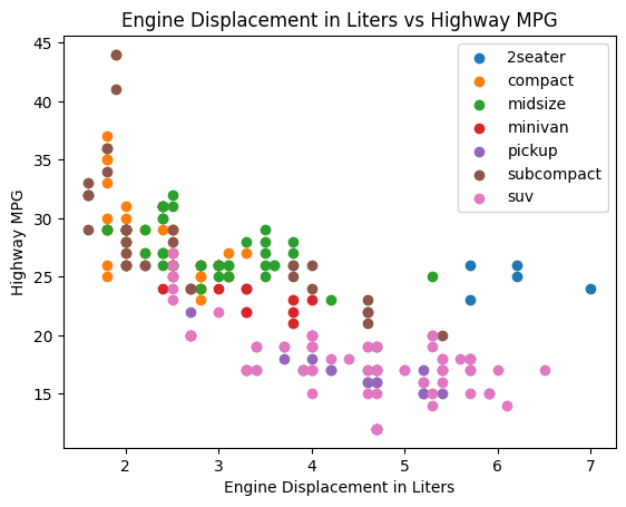
(sns
 .FacetGrid(mpg, hue='class', height=5)
 .map(plt.scatter, 'displ', 'hwy')
 .add_legend()
 .set(
    title='Engine Displacement in Liters vs Highway MPG',
    xlabel='Engine Displacement in Liters',
    ylabel='Highway MPG'
))
<seaborn.axisgrid.FacetGrid at 0x16b31f230>
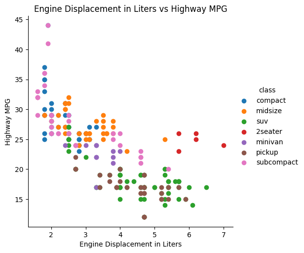
(ggplot(mpg) +
    aes(x = 'displ', y = 'hwy', color = 'class') +
    geom_point() +
    ggtitle('Engine Displacement in Liters vs Highway MPG') +
    xlab('Engine Displacement in Liters') +
    ylab('Highway MPG'))
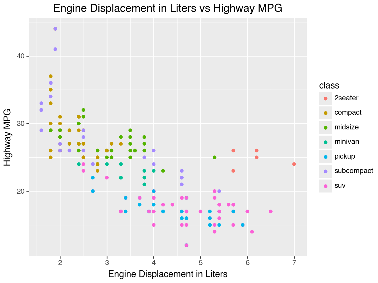
fig = px.scatter(
    mpg,
    x='displ',
    y='hwy',
    color='class',
    title='Engine Displacement in Liters vs Highway MPG',
    labels={
        'displ': 'Engine Displacement in Liters',
        'hwy': 'Highway MPG',
        'class': 'Vehicle Class'
    }
)

fig.show()